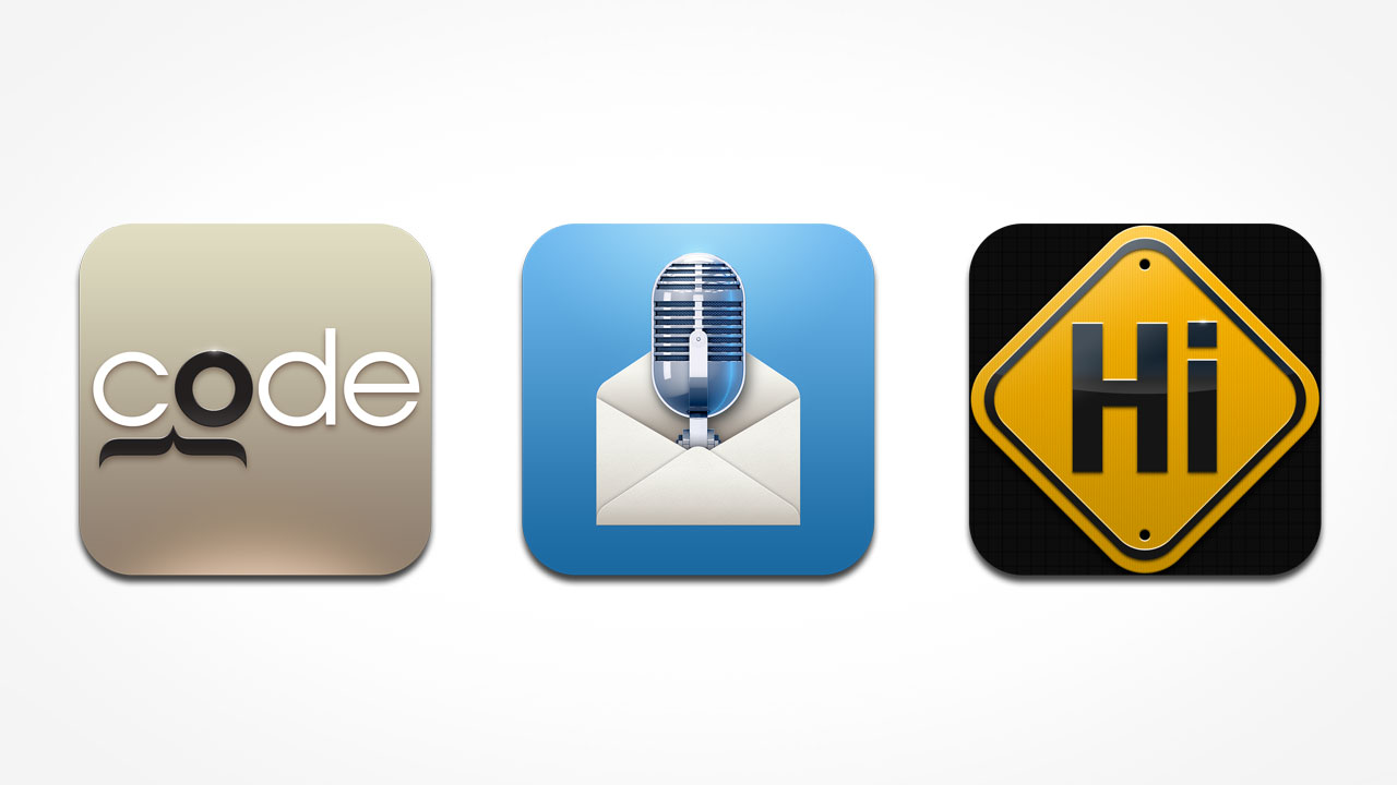
With all the great fun we had since our very first Android app icon design project, we’ve longed for a chance to make one for our favorite platform, iOS. You can imagine how overjoyed we were when we got to work with Carnation Software to design not one, but three of their app icons! Two of them are remakes of their existing apps, and one is a brand new app. As always, we wanted the designs to look 3-dimensional and full of detail, so that they would really pop on a Retina display. Read on to see how we overcame various design challenges along the way!
Code Sleuth — 1. Keep the idea simple
 Code Sleuth is an app that searches for solutions to Mac system errors. It finds Mac system error codes and does an advanced Google search for a solution. The old design used a silhouette of Sherlock Holmes, and a magnifying glass over a background of type that resembled code. While this was a novel idea, its execution turned out to be visually too complex, with repeating visual metaphors fighting for attention.

So our solution was to simplify, opting for an all-type design, while still preserving the idea of the sleuth. We also did adaptations for their companion app, PC Code Sleuth, as well as a logotype for the product name. Code Sleuth is available on the iTunes App Store.
Say It & Mail It — 2. It’s all in the details
 This innovative app lets you record voice messages or memos, attach a Google Map link and even a photo or movie, and bundle them all together in a single email. There is so much functionality in this app that it is difficult to design an icon that visually represents every feature. This is what the old design attempted to achieve, but the result was too cluttered with the use of a photographic element, especially when viewed at actual size on an iOS device.
For our new design, we zeroed in on the key attribute which the name ‘Say It & Mail It’ already clearly implies—that you can mail a voice recording. Having established the main form, we then focussed on rendering the icon, using Cinema 4d to create the 3d microphone. The various tiny details on the artwork—from the paper grain on the envelope, to the grilles and reflections on the microphone—combine to give the final icon a very rich, intricate look and feel, while still retaining clarity.

Hi Sign — 3. Make it obvious
Hi Sign lets you connect a web banner with your own messages, turning the iPad into a display sign that can be used for business or just for fun. In our design process for all the icons, we paid close attention to Apple’s Icon Design Guidelines, and with Hi Sign this meant that we had to avoid imagery that used the iPad as a signboard. We knew though, that having ‘Hi’ in the icon was crucial for retention and recall. Very often I see designs that try to be too clever, and miss this important point; when the visuals become too ‘codified’ the message becomes more layered and less immediate. In the end the ‘alert sign’ treatment became the obvious choice. For the final rendering, we went again with stylised realism, adding shading, glints and highlights sparingly, to retain a more graphic treatment. Hi Sign is available on the iTunes App Store.

Professional and Pleasing
Rich Love, President of Carnation Software, is a great client. He is receptive to new and unusual ideas, and very decisive and responsive. He had this to say about our work:
I am very pleased with the icons you designed for Say it & Mail it, Code Sleuth and Hi Sign. They are very professional and pleasing to look at. I don’t think they could be better at any price and your prices are very reasonable.
At the end of the day, I think businesses want designs that are ‘professional and pleasing to look at’. The art should not only be drawing attention unto itself, it should convey a message, an emotion, about the product/company/service that it represents. We don’t look at a logo, or icon and say “Wow, look at those reflections, and that interesting use of complementary colours!”. Instead, we ‘feel’ that it looks slick and polished, intelligent and accurate, or cheerful and delicious, and associate these values with the brand that it stands for.
Calling all developers… Work with us!
If you’re making an app, and need icon designs or UI elements crafted with care, please contact us, we can’t wait to do more! You call also talk to us on Twitter.

